

Why Your Layout Isn’t Working — and How Visual Hierarchy Fixes It
Ever used an app or visited a website that had everything — yet you remembered nothing?
That’s not a content problem. That’s a visual hierarchy problem and it’s one of the easiest UX problems to fix once you understand it. Because most designers know visual hierarchy matters. Few actually know how to use it.
What visual hierarchy actually means?

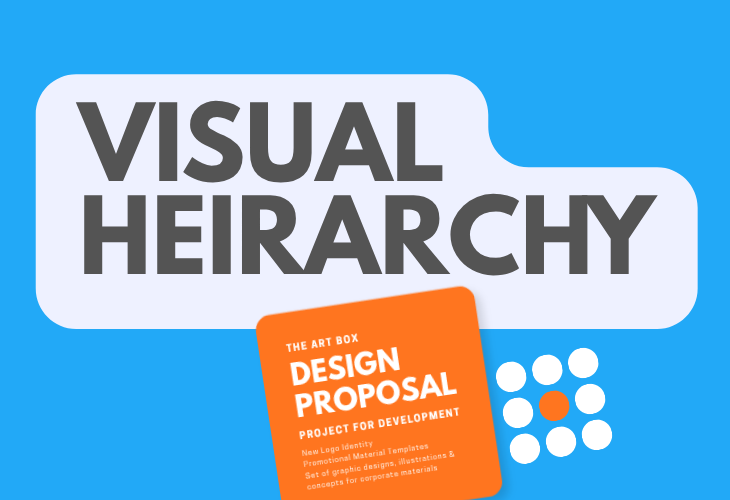
Visual hierarchy is the invisible architecture behind every layout that works, the thing that tells a viewer’s eye exactly where to go and in what order.
As the Interaction Design Foundation notes, this principle is what ultimately determines whether users can scan efficiently, locate what they need, and act without friction. When applied correctly, visual hierarchy produces a seamless, intuitive experience, guiding attention exactly where it is required. When neglected, the opposite occurs: users become disoriented, overlook critical information, and encounter mounting cognitive load — often to the point of abandoning the page altogether.
Why Visual Hierarchy Matters More Than You Think
Chasing trends is easy. Structuring information isn’t — and that’s where most designers lose the plot. Color catches the eye. Visual hierarchy controls the mind — guiding user behavior and shaping the entire user experience.
- Reduces Decision Fatigue: A clear visual hierarchy makes the main action stand out instantly, so users don’t waste time figuring out what to do next.
- Boosts Conversion Rate: Well-structured interfaces guide users toward the goal faster, which means fewer drop-offs and better conversion rates.
- Supports Accessibility & Inclusive Design: Organizing content logically helps everyone — including users relying on screen readers and other assistive technology — navigate with ease.
Core Principles of Visual Hierarchy
- Size and Scale: Size and scale are fundamental tools in visual hierarchy, used to communicate which information matters most. Size refers to the physical dimensions of an individual element, while scale defines how that element is proportioned relative to everything else on the page. Larger elements naturally command greater attention within the hierarchy, positioning them as primary focal points, while smaller elements recede into a secondary role, supporting rather than competing for the viewer’s focus.

- Color & Contrast: Bright colors and strong contrast make key elements (like buttons or error messages) impossible to miss.

- Grouping & Spacing: Things placed close together feel related (like a photo and its caption). Empty space around an element makes it stand out more.

- Typography: Bigger, bolder text for headlines and smaller text for body content helps users scan the page instead of reading every word. Visual hierarchy in typography relies on intentional font pairing and varied typeface sizing to emphasize text-based information. Key ideas warranting emphasis should be rendered in larger or bolder text, ensuring they capture the visitor’s attention first, while supplementary content should adopt a smaller size or a less dominant font to signal its secondary role.

- Reading Patterns: Users naturally scan pages in predictable patterns — the F-pattern for text-heavy pages and the Z-pattern for landing pages. Designing with these patterns in mind feels natural to the user. The Z-pattern guides the eye from the top-left corner to the top-right, then diagonally down to the bottom-left, before concluding at the bottom-right — with key elements such as logos or calls-to-action anchoring each corner. The F-pattern, by contrast, follows a denser, repeated left-to-right scanning motion, making it particularly effective for text-heavy pages.
How to Apply Visual Hierarchy to Your Own Designs
Getting visual hierarchy right doesn’t require complex rules — just a clear process:
- Identify What Matters Most: Before designing anything, decide what the single most important action or piece of information on that screen should be.
- Keep It Simple: Stick to a consistent grid and limit the number of font sizes and colors you use. Fewer variables mean less visual clutter.
- Run the 5-Second Test: Show your design to someone for just 5 seconds, then ask: Where am I? What can I do here? What matters most? If they can’t answer quickly, your hierarchy needs work.
Conclusion
Visual hierarchy isn’t just a design principle — it’s the difference between an interface users understand instantly and one they abandon out of frustration. Every strong layout, every high-converting screen, and every smooth user experience starts with the same foundation: guiding the user’s eye to what matters, in the right order, at the right time.
The good news? You don’t need to overhaul your entire design process to get this right. Start small — audit one screen, identify its single most important action, and apply the principles of size, contrast, spacing, and typography to bring that priority forward. Over time, this becomes second nature, and your designs will naturally feel clearer, more intuitive, and more effective.
Trends will keep changing. Visual hierarchy won’t. Master it once, and it’ll make every design you create better — for your users, and for the goals your design is meant to achieve.